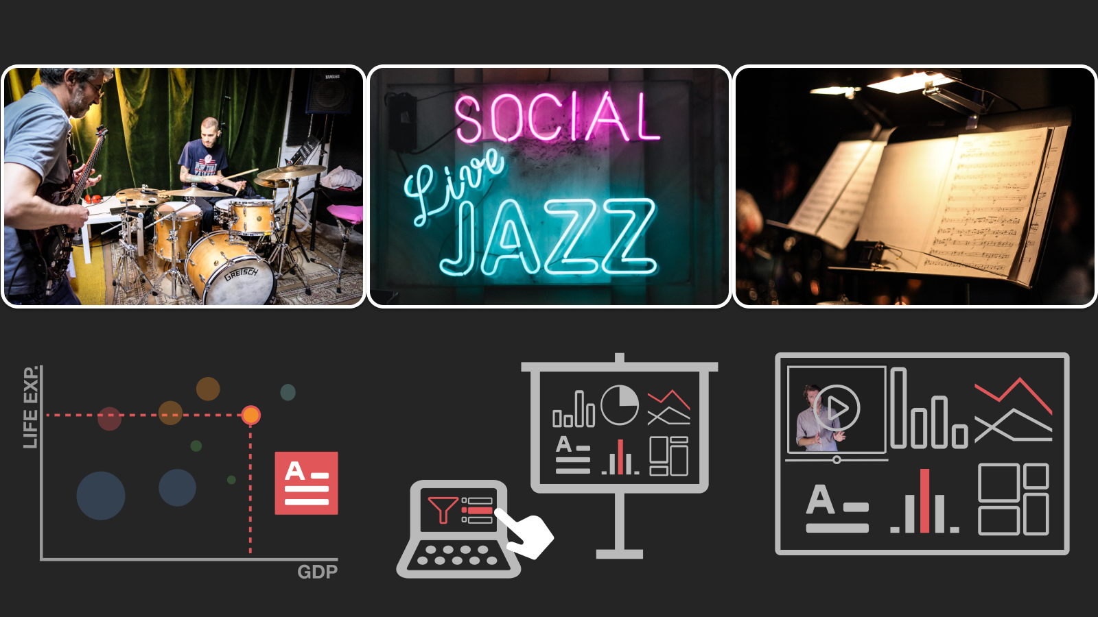
From Jam Session to Recital: Synchronous Communication and Collaboration Around Data in Organization
Matthew Brehmer, Robert Kosara
View presentation:2021-10-27T15:45:00ZGMT-0600Change your timezone on the schedule page
2021-10-27T15:45:00Z
Fast forward
Direct link to video on YouTube: https://youtu.be/D0vku033WX8
Abstract
Prior research on communicating with visualization has focused on public presentation and asynchronous individual consumption, such as in the domain of journalism. The visualization research community knows comparatively little about synchronous and multimodal communication around data within organizations, from team meetings to executive briefings. We conducted two qualitative interview studies with individuals who prepare and deliver presentations about data to audiences in organizations. In contrast to prior work, we did not limit our interviews to those who self-identify as data analysts or data scientists. Both studies examined aspects of speaking about data with visual aids such as charts, dashboards, and tables. One study was a retrospective examination of current practices and difficulties, from which we identified three scenarios involving presentations of data. We describe these scenarios using an analogy to musical performance: small collaborative team meetings are akin to jam session, while more structured presentations can range from semi-improvisational performances among peers to formal recitals given to executives or customers. In our second study, we grounded the discussion around three design probes, each examining a different aspect of presenting data: the progressive reveal of visualization to direct attention and advance a narrative, visualization presentation controls that are hidden from the audience’s view, and the coordination of a presenter’s video with interactive visualization. Our distillation of interviewees’ responses surfaced twelve themes, from ways of authoring presentations to creating accessible and engaging audience experiences.