Rotate or Wrap? Interactive Visualisations of Cyclical Data on Cylindrical or Toroidal Topologies
Kun-Ting Chen, Tim Dwyer, Benjamin Bach, Kim Marriott
External link (DOI)
View presentation:2021-10-27T13:30:00ZGMT-0600Change your timezone on the schedule page
2021-10-27T13:30:00Z
Fast forward
Direct link to video on YouTube: https://youtu.be/-SMB0pJ17rI
Abstract
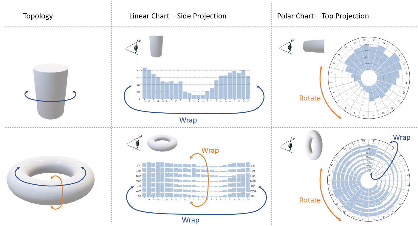
In this paper, we report on a study of visual representations for cyclical data and the effect of interactively wrapping a bar chart ‘around its boundaries’. Compared to linear bar chart, polar (or radial) visualisations have the advantage that cyclical data can be presented continuously without mentally bridging the visual ‘cut’ across the left-and-right boundaries. To investigate this hypothesis and to assess the effect the cut has on analysis performance, this paper presents results from a crowdsourced, controlled experiment with 72 participants comparing new continuous panning technique to linear bar charts (interactive wrapping). Our results show that bar charts with interactive wrapping lead to less errors compared to standard bar charts or polar charts. Inspired by these results, we generalise the concept of interactive wrapping to other visualisations for cyclical or relational data. We describe a design space based on the concept of one-dimensional wrapping and two-dimensional wrapping, linked to two common 3D topologies; cylinder and torus that can be used to metaphorically explain one- and two-dimensional wrapping. This design space suggests that interactive wrapping is widely applicable to many different data types.