Visual Arrangements of Bar Charts Influence Comparisons in Viewer Takeaways
Cindy Xiong, Vidya Setlur, Benjamin Bach, Kylie Lin, Eunyee Koh, Steven Franconeri
External link (DOI)
View presentation:2021-10-29T14:15:00ZGMT-0600Change your timezone on the schedule page
2021-10-29T14:15:00Z
Fast forward
Direct link to video on YouTube: https://youtu.be/uQWXEvr8Qlc
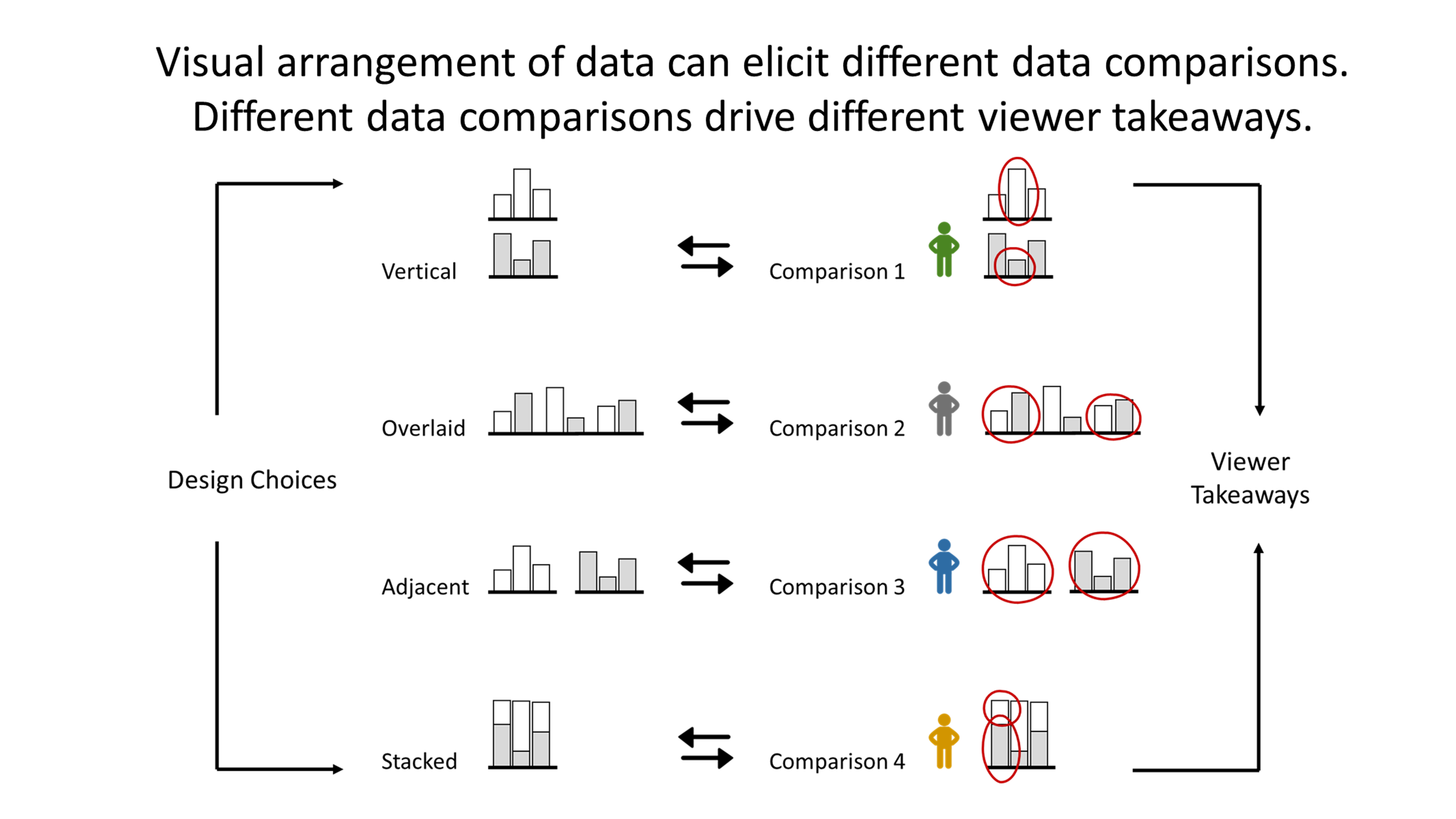
Abstract
Well-designed data visualizations can lead to more powerful and intuitive processing by a viewer. To help a viewer intuitively compare values to quickly generate key takeaways, visualization designers can manipulate how data values are arranged in a chart to afford particular comparisons. Using simple bar charts as a case study, we empirically tested the comparison affordances of four common arrangements: vertically juxtaposed, horizontally juxtaposed, overlaid, and stacked. We asked participants to type out what patterns they perceived in a chart and we coded their takeaways into types of comparisons. In a second study, we asked data visualization design experts to predict which arrangement they would use to afford each type of comparison and found both alignments and mismatches with our findings. These results provide concrete guidelines for how both human designers and automatic chart recommendation systems can make visualizations that help viewers extract the ``right'' takeaway.