Intercept Graph: An Interactive Radial Visualization for Comparison of State Changes
Shaolun Ruan, Yong Wang, Qiang Guan
External link (DOI)
View presentation:2021-10-29T13:50:00ZGMT-0600Change your timezone on the schedule page
2021-10-29T13:50:00Z
Fast forward
Direct link to video on YouTube: https://youtu.be/WbSQHyqAKpY
Keywords
Mathematical Foundations & Numerical Methods, Other Application Areas, Art & Graphic Design, Data Analysis, Reasoning, Problem Solving, and Decision Making, Perception & Cognition, Interaction Design, Visual Representation Design, Temporal Data
Abstract
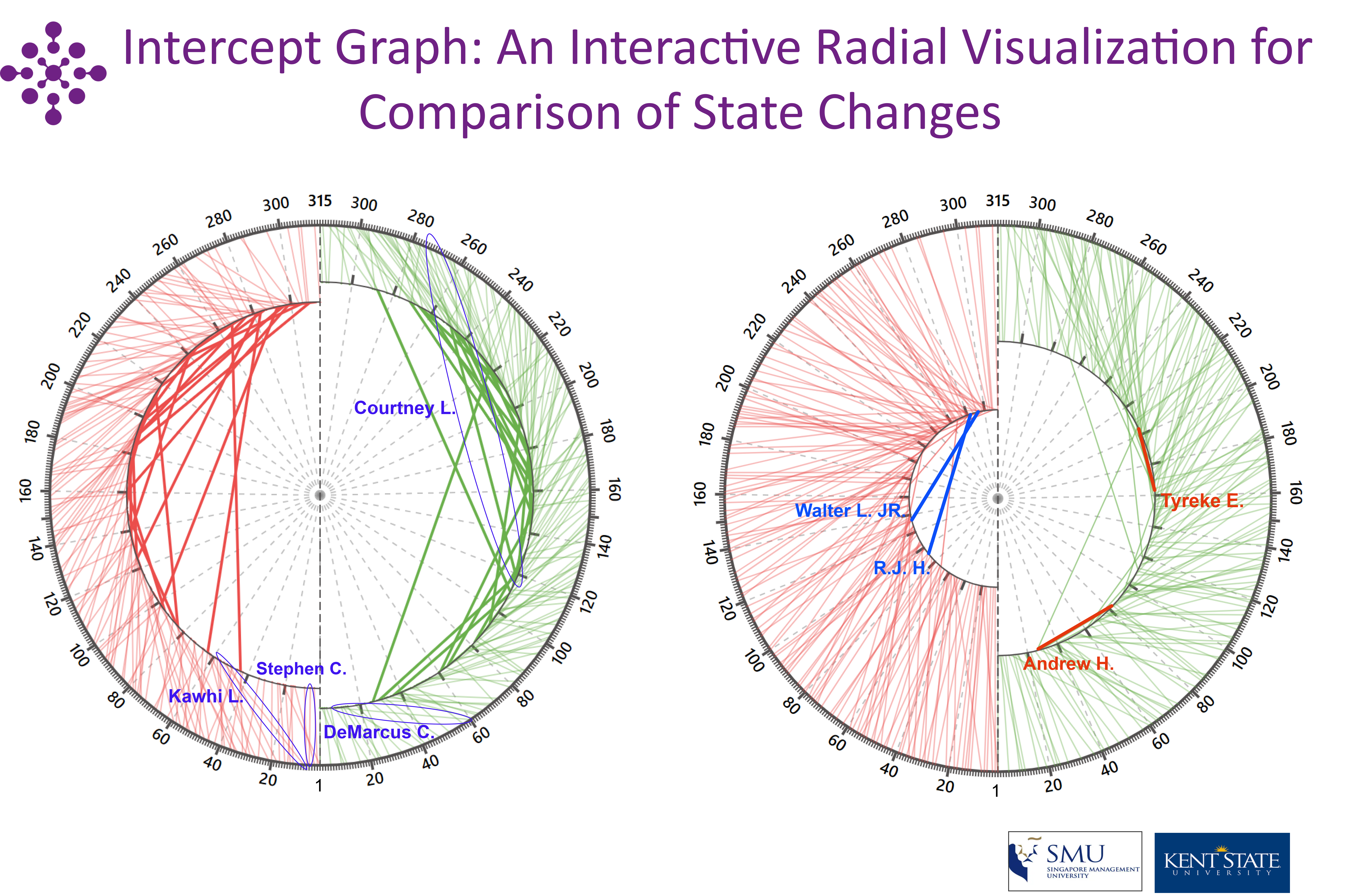
State change comparison of multiple data items is often necessary in multiple application domains, such as medical science, financial engineering, sociology, etc. Slope graphs and grouped bar charts have been widely used to show a "before-and-after'' story of different data states and indicate their changes. However, they visualize state changes as either slope or difference of bars, which has been proved less effective for quantitative comparison. Also, both visual designs suffer from visual clutter issues with an increasing number of data items. In this paper, we propose Intercept Grpah, a novel visual design to facilitate effective interactive comparison of state changes. Specifically, a radial design is proposed to visualize the starting and ending states of each data item on two concentric circles and the chord length explicitly encodes the "state change''. By interactively adjusting the inner circle radius, Intercept Grpah can smoothly filter out the large state changes and magnify the difference between similar state changes, mitigating the visual clutter issues and enhancing the effective comparison of state changes. We conducted case studies through comparing Intercept Grpah with slope graphs and grouped bar charts on real datasets to demonstrate the effectiveness of Intercept Grpah.