Affective Congruence in Visualization Design: Influences on Reading Categorical Maps
Cary Anderson, Anthony Robinson
External link (DOI)
View presentation:2021-10-27T13:45:00ZGMT-0600Change your timezone on the schedule page
2021-10-27T13:45:00Z
Fast forward
Direct link to video on YouTube: https://youtu.be/ELPML9RGhEY
Keywords
.
Abstract
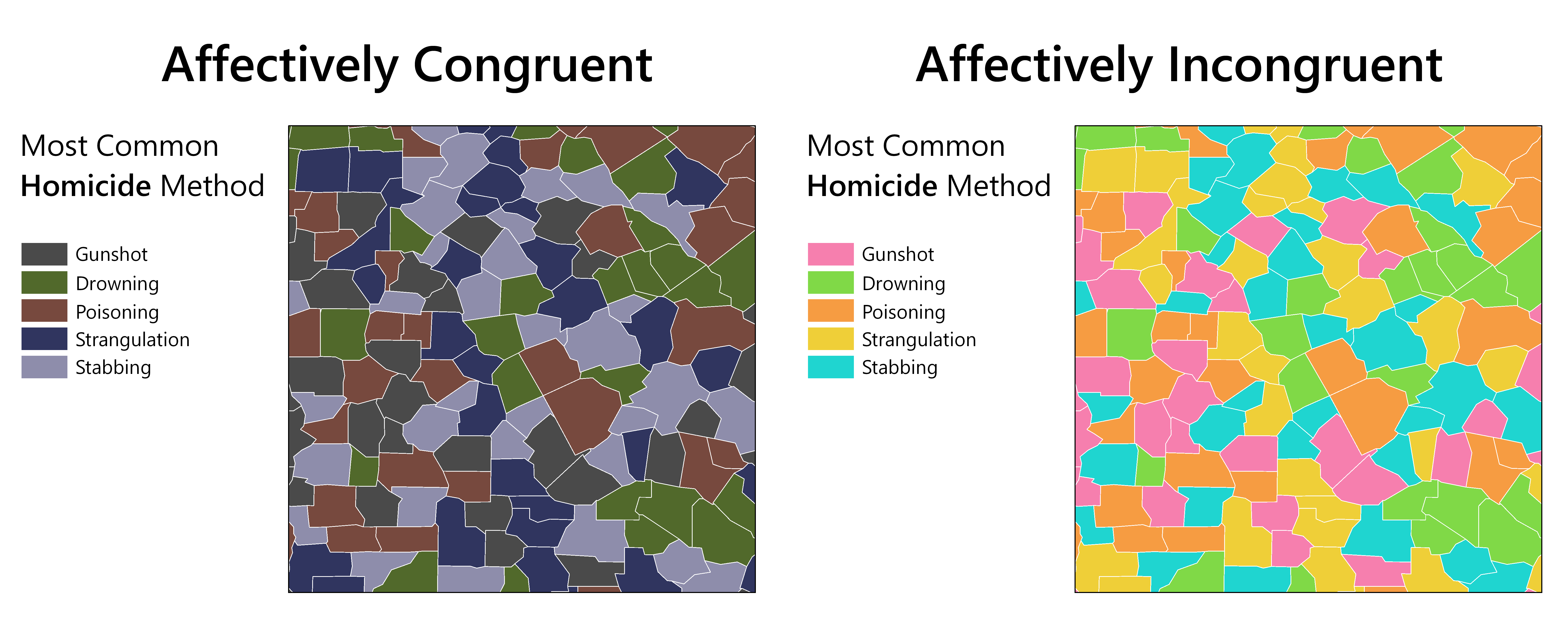
Recent work in data visualization has demonstrated that small, perceptually-distinct color palettes—such as those used in categorical mapping—can connote significant affective qualities. Data that are mapped or otherwise visualized are also often emotive in nature, either inherently (e.g., climate change, disease mortality rates), or by design, such as can be found in visual storytelling. However, little is known about how the affective qualities of color interact with those of data context in visualization design. This paper describes the results of a crowdsourced study on the influence of affectively congruent versus incongruent color schemes on categorical map-reading response. We report both objective (pattern detection; area comparison) and subjective (affective quality; appropriateness; preference) measures of map-reader response. Our results suggest that affectively congruent colors amplify perceptions of the affective qualities of maps with emotive topics, affective incongruence may cause confusion, and that affective congruence is particularly influential in maps of positive-leaning data topics. Finally, we offer preliminary design recommendations for balancing color congruence with other design factors, and for synthesizing color and affective context in thematic map design.