Declutter and Focus: Empirically Evaluating Design Guidelines for Effective Data Communication
Kiran Ajani, Elsie Lee, Cindy Xiong, Cole Knaflic, William Kemper, Steven Franconeri
External link (DOI)
View presentation:2021-10-29T13:45:00ZGMT-0600Change your timezone on the schedule page
2021-10-29T13:45:00Z
Fast forward
Direct link to video on YouTube: https://youtu.be/ByGd1rZ6dJM
Keywords
H.1.2.a Human factors < H.1.2 User/Machine Systems < H.1 Models and Principles < H Information Technology and Systems, H.5.3.d Evaluation/methodology < H.5.3 Group and Organization Interfaces < H.5 Information Interfaces and Representation (HCI) <, H.5.2.e Evaluation/methodology < H.5.2 User Interfaces < H.5 Information Interfaces and Representation (HCI) < H Information Tec, H.5.1.d Evaluation/methodology < H.5.1 Multimedia Information Systems < H.5 Information Interfaces and Representation (HCI) < H
Abstract
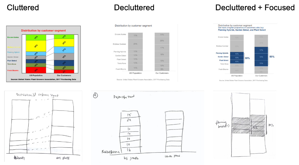
Data visualization design has a powerful effect on which patterns we see as salient and how quickly we see them. The visualization practitioner community prescribes two popular guidelines for creating clear and efficient visualizations: declutter and focus. The declutter guidelines suggest removing non-critical gridlines, excessive labeling of data values, and color variability to improve aesthetics and to maximize the emphasis on the data relative to the design itself. The focus guidelines for explanatory communication recommend including a clear headline that describes the relevant data pattern, highlighting a subset of relevant data values with a unique color, and connecting those values to written annotations that contextualize them in a broader argument. We evaluated how these recommendations impact recall of the depicted information across cluttered, decluttered, and decluttered+focused designs of six graph topics. Undergraduate students were asked to redraw previously seen visualizations, to recall their topics and main conclusions, and to rate the varied designs on aesthetics, clarity, professionalism, and trustworthiness. Decluttering designs led to higher ratings on professionalism, and adding focus to the design led to higher ratings on aesthetics and clarity. They also showed better memory for the highlighted pattern in the data, as reflected across redrawings of the original visualization and typed free-response conclusions, though we do not know whether these results would generalize beyond our memory-based tasks. The results largely empirically validate the intuitions of visualization designers and practitioners. The stimuli, data, analysis code, and Supplementary Materials are available at https://osf.io/wes9u/.