Metrics-Based Evaluation and Comparison of Visualization Notations
Nicolas Kruchten, Andrew M McNutt, Michael McGuffin
DOI: 10.1109/TVCG.2023.3326907
Room: 105
2023-10-25T03:36:00ZGMT-0600Change your timezone on the schedule page
2023-10-25T03:36:00Z
Fast forward
Full Video
Keywords
Notation, Usability, Evaluation, Language design, API design, Domain-specific languages.
Abstract
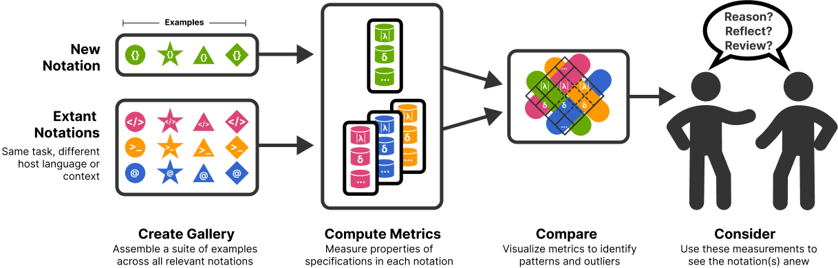
A visualization notation is a recurring pattern of symbols used to author specifications of visualizations, from data transformation to visual mapping. Programmatic notations use symbols defined by grammars or domain-specific languages (e.g., ggplot2, dplyr, Vega-Lite) or libraries (e.g., Matplotlib, Pandas). Designers and prospective users of grammars and libraries often evaluate visualization notations by inspecting galleries of examples. While such collections demonstrate usage and expressiveness, their construction and evaluation are usually ad hoc, making comparisons of different notations difficult. More rarely, experts analyze notations via usability heuristics, such as the Cognitive Dimensions of Notations framework. These analyses, akin to structured close readings of text, can reveal design deficiencies, but place a burden on the expert to simultaneously consider many facets of often complex systems. To alleviate these issues, we introduce a metrics-based approach to usability evaluation and comparison of notations in which metrics are computed for a gallery of examples across a suite of notations. While applicable to any visualization domain, we explore the utility of our approach via a case study considering statistical graphics that explores 40 visualizations across 9 widely used notations. We facilitate the computation of appropriate metrics and analysis via a new tool called NotaScope. We gathered feedback via interviews with authors or maintainers of prominent charting libraries (n=6). We find that this approach is a promising way to formalize, externalize, and extend evaluations and comparisons of visualization notations.