The Arrangement of Marks Impacts Afforded Messages: Ordering, Partitioning, Spacing, and Coloring in Bar Charts
Racquel Fygenson, Steven L Franconeri, Enrico Bertini
DOI: 10.1109/TVCG.2023.3326590
Room: 109
2023-10-26T00:45:00ZGMT-0600Change your timezone on the schedule page
2023-10-26T00:45:00Z
Fast forward
Full Video
Keywords
Perception & cognition, Methodologies, Human-subjects qualitative studies, Human-subjects quantitative studies, Charts, diagrams and plots, General public
Abstract
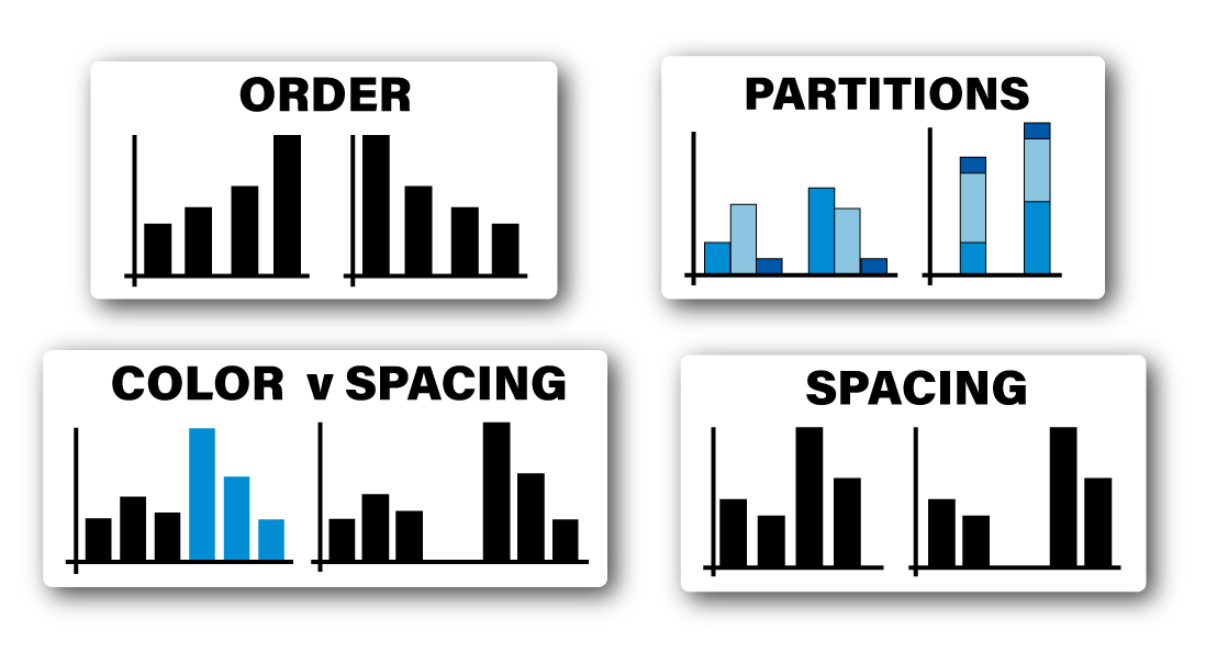
Data visualizations present a massive number of potential messages to an observer. One might notice that one group's average is larger than another's, or that a difference in values is smaller than a difference between two others, or any of a combinatorial explosion of other possibilities. The message that a viewer tends to notice – the message that a visualization ‘affords’ – is strongly affected by how values are arranged in a chart, e.g., how the values are colored or positioned. Although understanding the mapping between a chart’s arrangement and what viewers tend to notice is critical for creating guidelines and recommendation systems, current empirical work is insufficient to lay out clear rules. We present a set of empirical evaluations of how different messages--including ranking, grouping, and part-to-whole relationships--are afforded by variations in ordering, partitioning, spacing, and coloring of values, within the ubiquitous case study of bar graphs. In doing so, we introduce a quantitative method that is easily scalable, reviewable, and replicable, laying groundwork for further investigation of the effects of arrangement on message affordances across other visualizations and tasks. Pre-registration and all supplemental materials are available at https://osf.io/np3q7 and https://osf.io/bvy95, respectively.