Show me my Users: A Dashboard Design Visualizing User Interaction Logs with Interactive Visualization
Jinrui Wang, Mashael AlKadi, Benjamin Bach
Room: 104
2023-10-26T00:21:00ZGMT-0600Change your timezone on the schedule page
2023-10-26T00:21:00Z
Fast forward
Full Video
Keywords
Human-centered computing—Visualization—Visualization design and evaluation methods; Human-centered computing—Visualization—Visualization application domains—Visual Analytics
Abstract
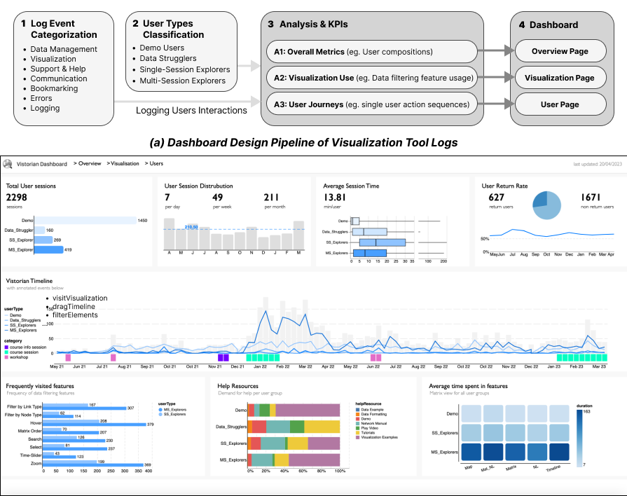
This paper describes the design of a dashboard and analysis pipeline to monitor users of visualization tools in the wild. Our pipeline describes how to extract analysis KPIs from extensive log event data and a mix of user types. The resulting three-page dashboard displays live KPIs, helping analysts to understand users, detect exploratory behaviors, plan education interventions, and improve tool features. We propose this case study as a motivation to use the dashboard approach for a more `casual' monitoring of users and building carer mindsets for visualization tools.