What Is the Difference Between a Mountain and a Molehill? Quantifying Semantic Labeling of Visual Features in Line Charts
Dennis Bromley, Vidya Setlur
Room: 104
2023-10-26T00:30:00ZGMT-0600Change your timezone on the schedule page
2023-10-26T00:30:00Z
Fast forward
Full Video
Keywords
Semantics, trends, annotation, text generation.
Abstract
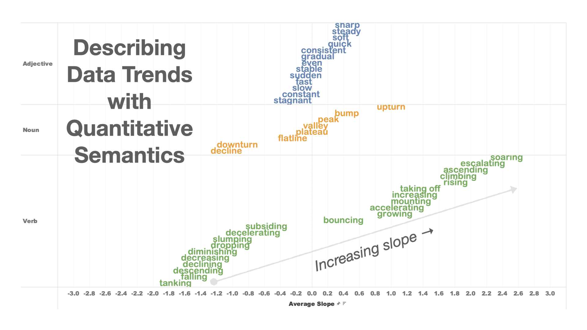
Relevant language describing visual features in charts can be useful for authoring captions and summaries about the charts to help with readers' takeaways. To better understand the interplay between concepts that describe visual features and the semantic relationships among those concepts (e.g., 'sharp increase' vs. 'gradual rise'), we conducted a crowdsourced study to collect labels and visual feature pairs for univariate line charts. Using this crowdsourced dataset of labeled visual signatures, this paper proposes a novel method for labeling visual chart features based on combining feature-word distributions with the visual features and the data domain of the charts. These feature-word-topic models identify word associations with similar yet subtle differences in semantics, such as 'flat,' 'plateau,' and 'stagnant,' and descriptors of the visual features, such as 'sharp increase,' 'slow climb,' and 'peak.' Our feature-word-topic model is computed using both a quantified semantics approach and a signal processing-inspired least-errors shape-similarity approach. We finally demonstrate the application of this dataset for annotating charts and generating textual data summaries.