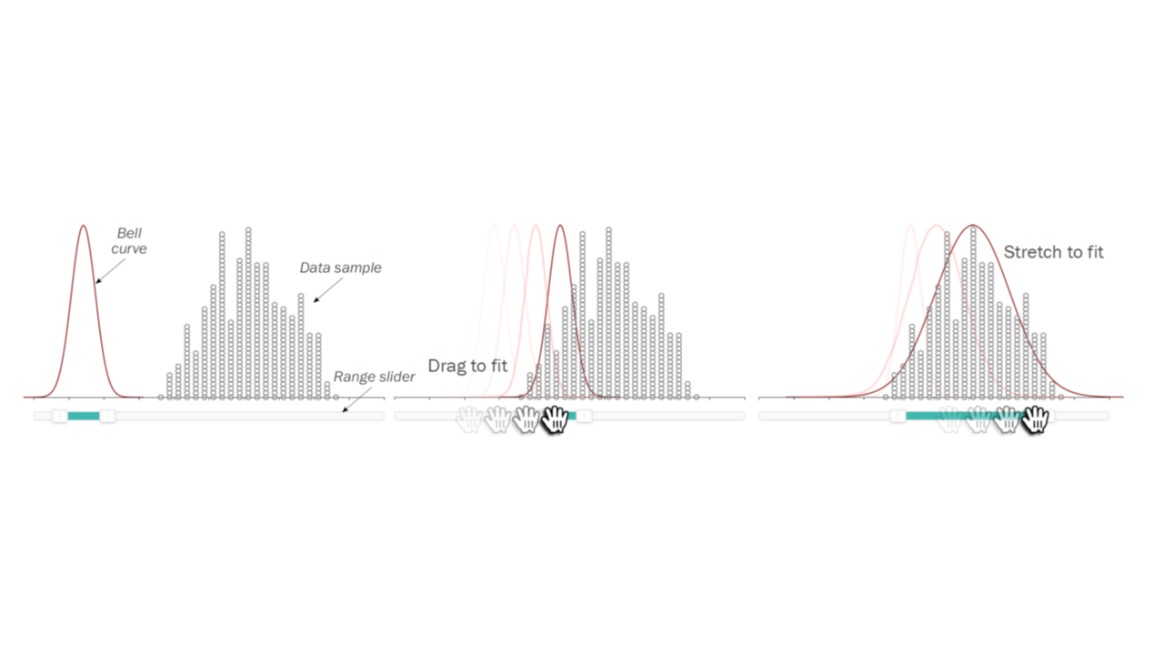
Fitting Bell Curves to Data Distributions using Visualization
Eric Newburger, Michael Correll, Niklas Elmqvist
DOI: 10.1109/TVCG.2022.3210763
Room: 109
2023-10-26T00:21:00ZGMT-0600Change your timezone on the schedule page
2023-10-26T00:21:00Z

Fast forward
Full Video
Keywords
Graphical inference;visual statistics;statistics by eye;fitting distributions;crowdsourcing
Abstract
Idealized probability distributions, such as normal or other curves, lie at the root of confirmatory statistical tests. But how well do people understand these idealized curves? In practical terms, does the human visual system allow us to match sample data distributions with hypothesized population distributions from which those samples might have been drawn? And how do different visualization techniques impact this capability? This paper shares the results of a crowdsourced experiment that tested the ability of respondents to fit normal curves to four different data distribution visualizations: bar histograms, dotplot histograms, strip plots, and boxplots. We find that the crowd can estimate the center (mean) of a distribution with some success and little bias. We also find that people generally overestimate the standard deviation---which we dub the "umbrella effect" because people tend to want to cover the whole distribution using the curve, as if sheltering it from the heavens above---and that strip plots yield the best accuracy.