Alternatives to Contour Visualizations for Power Systems Data
Isaiah Lyons-Galante, Morteza Karimzadeh, Sam Molnar, Graham Johnson, Kenny Gruchalla
Room: 103
2023-10-21T22:00:00ZGMT-0600Change your timezone on the schedule page
2023-10-21T22:00:00Z
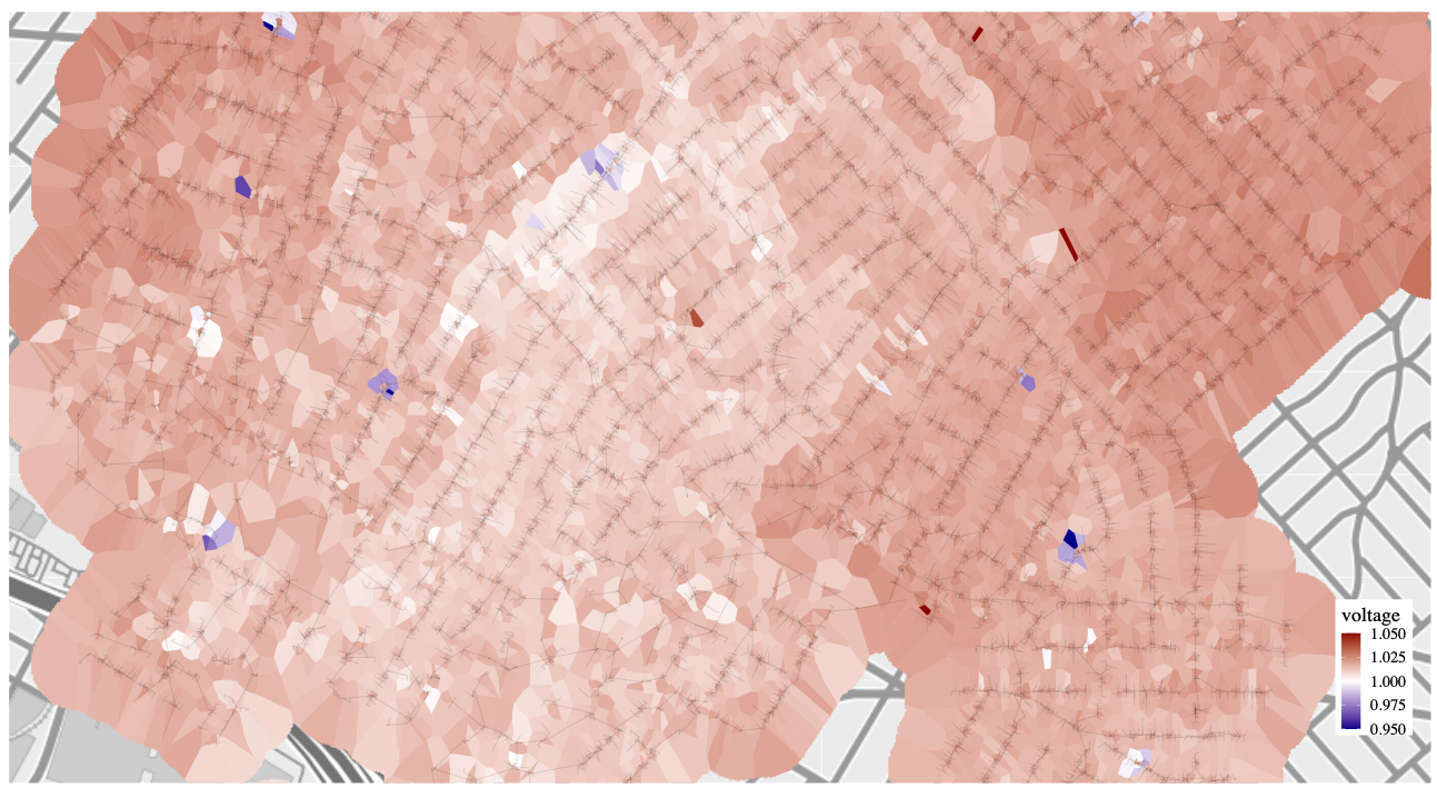
Abstract
Electrical grids are geographical and topological structures whose voltage states are challenging to represent accurately and efficiently for visual analysis. The current common practice is to use colored contour maps, yet these can misrepresent the data. We examine the suitability of four alternative visualization methods for depicting voltage data in a geographically dense distribution system—Voronoi polygons, H3 tessellations, S2 tessellations, and a network-weighted contour map. We find that Voronoi tessellations and network-weighted contour maps more accurately represent the statistical distribution of the data than regular contour maps.