An Interactive, Scenario-Based Visualization Dashboard for Model-to-Model Comparison
Erica Attard, Madeleine McPherson
Room: 103
2023-10-21T22:00:00ZGMT-0600Change your timezone on the schedule page
2023-10-21T22:00:00Z
Abstract
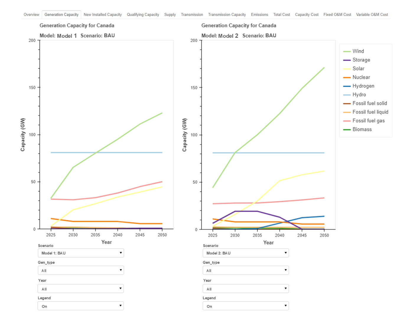
Energy models can have a large impact on policy options and decarbonization pathways, however, they are currently stunted by obstacles including the need for transparency, accessibility of model inputs and outputs, increased stakeholder engagement, and open-source tools. The Energy Modeling Hub has responded to this need with the development of an integrated modeling platform consisting of (1) a Canadian database for energy systems, (2) a suite of energy system models, and (3) a visualization dashboard. This paper focuses on the requirements and development of a visualization dashboard used to facilitate scenario comparison, multi-model comparison, and the co-development of scenarios. The design consists of a series of tabs supporting side-by-side visualizations with a multitude of interactive features including a hover tool, toolbar, data filters, buttons, and an interactive legend. The dashboard has been used in presentations to Ministers in the British Colombia Government and received positive feedback for transparently displaying results and supplemental information as well as allowing users to interact with the data in a way that can drive their own decisions. The visualization dashboard serves as a solid foundation to facilitate scenario-based and multi-model comparisons and close the communication gap between energy modelers and stakeholders. Future work includes expanding the visualization and interactive elements implemented, specifically for input data visualization.