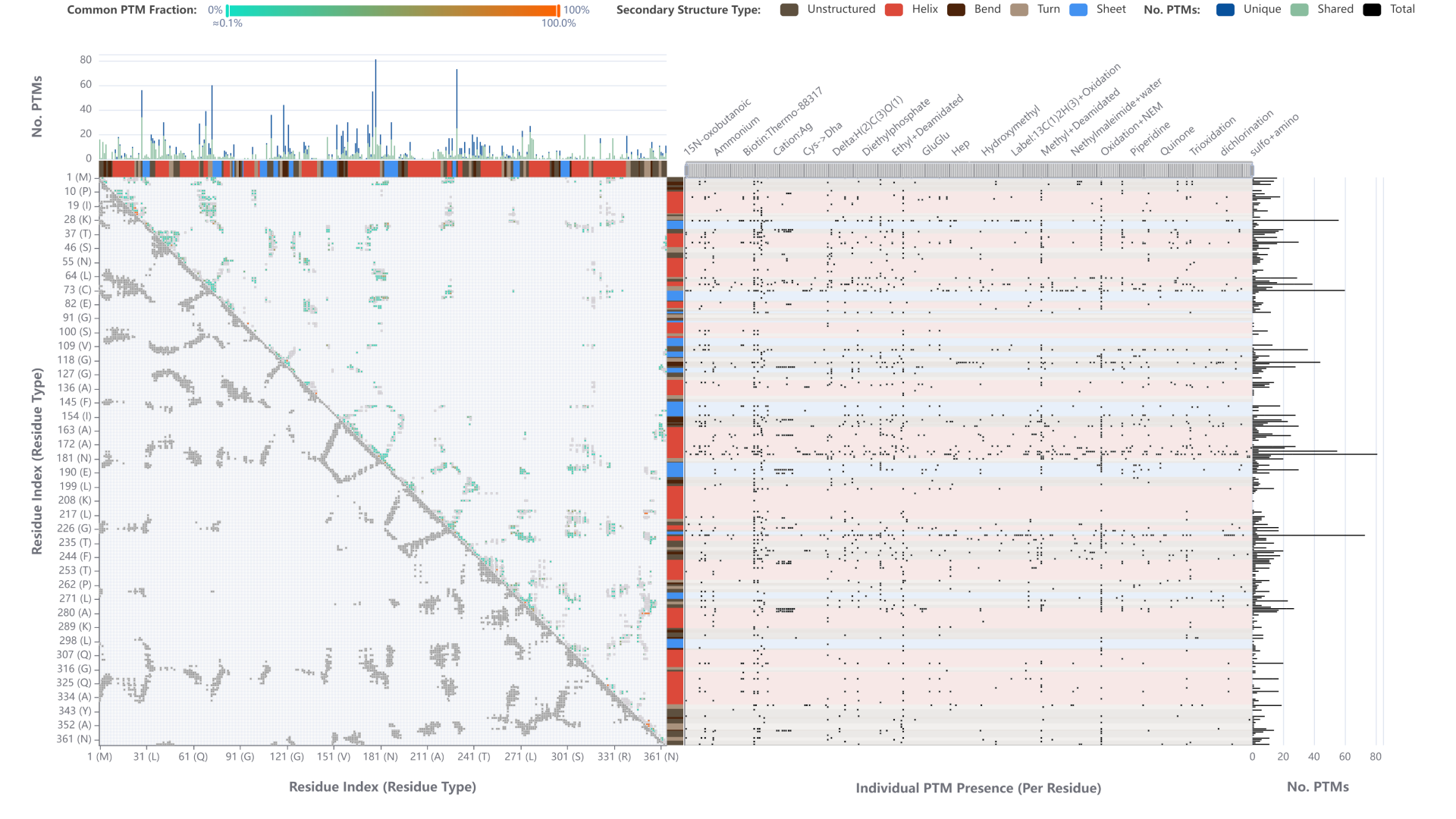
A Dashboard for the Visualisation of a Protein’s PTMs
Simon Hackl, Theresa Harbig, Caroline Jachmann, Mathias Witte Paz, Kay Nieselt
View presentation:2022-10-16T20:10:00ZGMT-0600Change your timezone on the schedule page
2022-10-16T20:10:00Z

The live footage of the talk, including the Q&A, can be viewed on the session page, Bio+MedVis: Challenges.
Abstract
In our submission we address the redesign task of the Bio+MedVis Challenge 2022. The existing visualization shows all post-translational modifications (PTMs) identified on a protein as circles that are connected to their position on the protein’s primary sequence by a line. Overall, the figure communicates well that there can be significantly more PTMs on proteins than anticipated. However, the visualization suffers from overplotting in multiple dimensions, rendering a detailed interpretation impossible. First, on the x-axis adjacent positions may carry PTMs, which causes the circles to overlap. Second, on the y-axis the PTMs for a position are stacked. From the visualizations, it is not clear if some PTMs are not displayed due to space limitations. Moreover, there are more different PTMs than there are colors that can be differentiated and a legend is missing. Most importantly, the visualization is based only on the primary sequence. No (visual) relation between PTMs and the protein structure can be established.