Striking a Balance: Reader Takeaways and Preferences when Integrating Text and Charts
Chase Stokes, Vidya Setlur, Bridget Cogley, Arvind Satyanarayan, Marti Hearst
View presentation:2022-10-21T15:00:00ZGMT-0600Change your timezone on the schedule page
2022-10-21T15:00:00Z
Prerecorded Talk
The live footage of the talk, including the Q&A, can be viewed on the session page, Natural Language Interaction.
Fast forward
Abstract
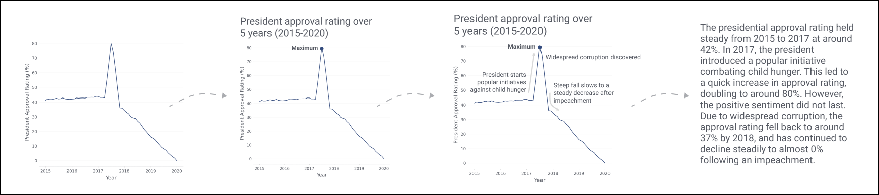
While visualizations are an effective way to represent insights about information, they rarely stand alone. When designing a visualization, text is often added to provide additional context and guidance for the reader. However, there is little experimental evidence to guide designers as to what is the right amount of text to show within a chart, what its qualitative properties should be, and where it should be placed. Prior work also shows variation in personal preferences for charts versus textual representations. In this paper, we explore several research questions about the relative value of textual components of visualizations. 302 participants ranked univariate line charts containing varying amounts of text, ranging from no text (except for the axes) to a written paragraph with no visuals. Participants also described what information they could take away from line charts with text having varying semantic content. We find that heavily annotated charts were not penalized. In fact, participants preferred the charts with the largest number of textual annotations over charts with fewer annotations or text alone. We also find effects of semantic content. For instance, the text that describes statistical or relational components of a chart leads to more takeaways regarding statistics or relational comparisons than text describing elemental or encoded components. Finally, we found different effects for the semantic levels based on the placement of the text on the chart; some kinds of information are best placed in the title, while others should be placed closer to the data. These results have important implications for chart design guidelines and future work pertaining to the combination of text and charts.