How Do Viewers Synthesize Conflicting Information from Data Visualizations?
Prateek Mantri, Hariharan Subramonyam, Audrey Michal, Cindy Xiong
View presentation:2022-10-20T20:00:00ZGMT-0600Change your timezone on the schedule page
2022-10-20T20:00:00Z

Prerecorded Talk
The live footage of the talk, including the Q&A, can be viewed on the session page, Storytelling.
Fast forward
Abstract
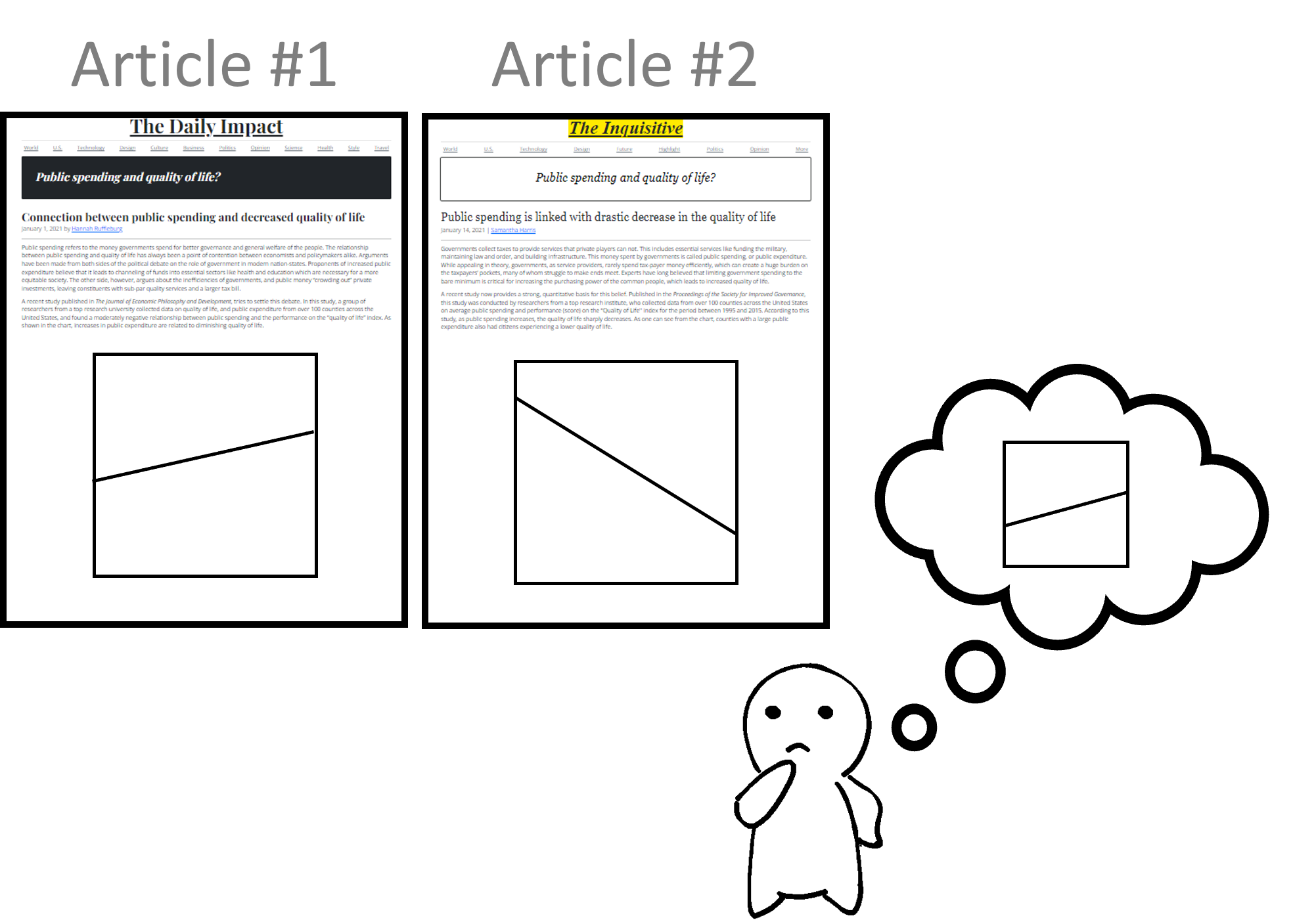
Scientific knowledge develops through cumulative discoveries that build on, contradict, contextualize, or correct prior findings. Scientists and journalists often communicate these incremental findings to lay people through visualizations and text (e.g., the positive and negative effects of caffeine intake). Consequently, readers need to integrate diverse and contrasting evidence from multiple sources to form opinions or make decisions. However, the underlying mechanism for synthesizing information from multiple visualizations remains under-explored. To address this knowledge gap, we conducted a series of four experiments (N = 1166) in which participants synthesized empirical evidence from a pair of line charts presented sequentially. In Experiment 1, we administered a baseline condition with charts depicting no specific context where participants held no strong belief. To test for the generalizability, we introduced real-world scenarios to our visualizations in Experiment 2 and added accompanying text descriptions similar to online news articles or blog posts in Experiment 3. In all three experiments, we varied the relative direction and magnitude of line slopes within the chart pairs. We found that participants tended to weigh the positive slope more when the two charts depicted relationships in the opposite direction (e.g., one positive slope and one negative slope). Participants tended to weigh the less steep slope more when the two charts depicted relationships in the same direction (e.g., both positive). Through these experiments, we characterize participants' synthesis behaviors depending on the relationship between the information they viewed, contribute to theories describing underlying cognitive mechanisms in information synthesis, and describe design implications for data storytelling.