Seeing What You Believe or Believing What You See? Belief Biases Correlation Estimation
Cindy Xiong, Chase Stokes, Yea-Seul Kim, Steven Franconeri
View presentation:2022-10-19T19:48:00ZGMT-0600Change your timezone on the schedule page
2022-10-19T19:48:00Z
Prerecorded Talk
The live footage of the talk, including the Q&A, can be viewed on the session page, Questioning Data and Data Bias.
Fast forward
Abstract
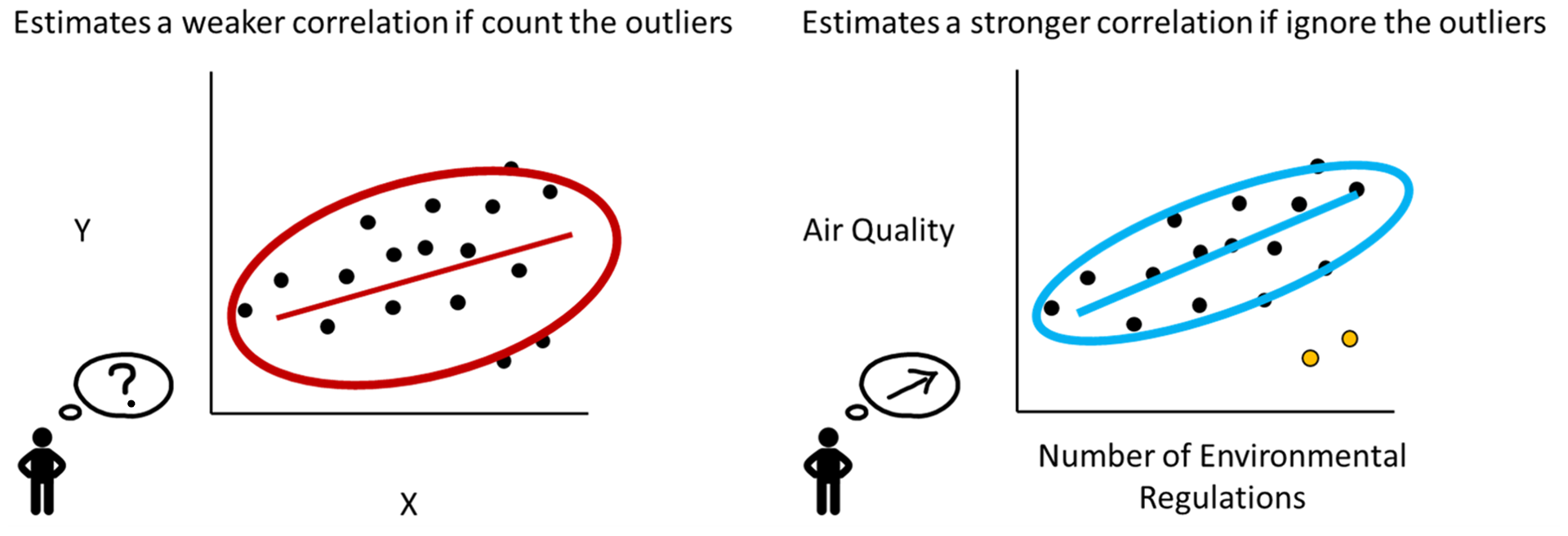
When an analyst or scientist has a belief about how the world works, their thinking can be biased in favor of that belief. Therefore, one bedrock principle of science is to minimize that bias by testing the predictions of one’s belief against objective data. But interpreting visualized data is a complex perceptual and cognitive process. Through two crowdsourced experiments, we demonstrate that supposedly objective assessments of the strength of a correlational relationship can be influenced by how strongly a viewer believes in the existence of that relationship. Participants viewed scatterplots depicting a relationship between meaningful variable pairs (e.g., number of environmental regulations and air quality) and estimated their correlations. They also estimated the correlation of the same scatterplots labeled instead with generic 'X' and 'Y' axes. In a separate section, they also reported how strongly they believed there to be a correlation between the meaningful variable pairs. Participants estimated correlations more accurately when they viewed scatterplots labeled with generic axes compared to scatterplots labeled with meaningful variable pairs. Furthermore, when viewers believed that two variables should have a strong relationship, they overestimated correlations between those variables by an r-value of about 0.1. When they believed that the variables should be unrelated, they underestimated the correlations by an r-value of about 0.1. While data visualizations are typically thought to present objective truths to the viewer, these results suggest that existing personal beliefs can bias even objective statistical values people extract from data.