Visualization Design Practices in a Crisis: Behind the Scenes with COVID-19 Dashboard Creators
Yixuan Zhang, Joseph D Gaggiano, Yifan Sun, Neha Kumar, Clio Andris, Andrea G Parker
View presentation:2022-10-20T19:48:00ZGMT-0600Change your timezone on the schedule page
2022-10-20T19:48:00Z
Prerecorded Talk
The live footage of the talk, including the Q&A, can be viewed on the session page, Reflecting on Academia and our Field.
Fast forward
Abstract
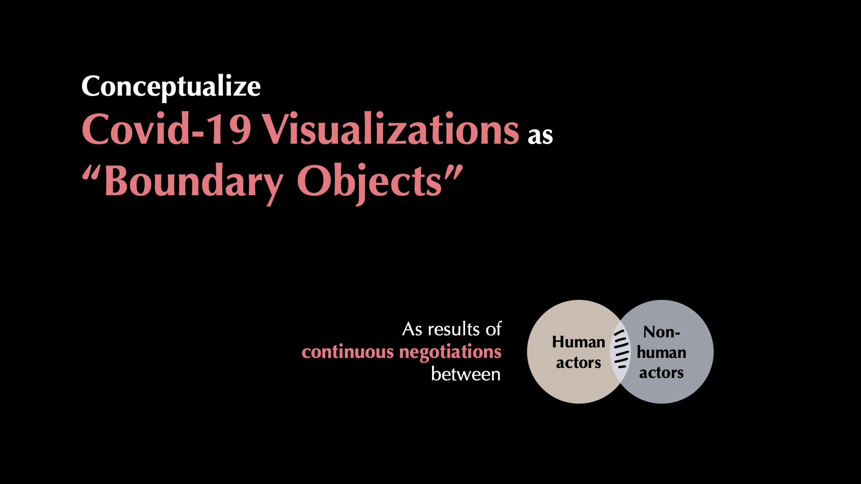
During the COVID-19 pandemic, a number of data visualizations were created to inform the public about the rapidly evolving crisis. Data dashboards, a form of information dissemination used during the pandemic, have facilitated this process by visualizing statistics regarding the number of COVID-19 cases over time. Prior work on COVID-19 visualizations has primarily focused on the design and evaluation of specific visualization systems from technology-centered perspectives. However, little is known about what occurs behind the scenes during the visualization creation processes, given the complex sociotechnical contexts in which they are embedded. Yet, such ecological knowledge is necessary to help characterize the nuances and trajectories of visualization design practices in the wild, as well as generate insights into how creators come to understand and approach visualization design on their own terms and for their own situated purposes. In this research, we conducted a qualitative interview study among dashboard creators from federal agencies, state health departments, mainstream news media outlets, and other organizations that created (often widely-used) COVID-19 dashboards to answer the following questions: how did visualization creators engage in COVID-19 dashboard design, and what tensions, conflicts, and challenges arose during this process? Our findings detail the trajectory of design practices---from creation to expansion, maintenance, and termination---that are shaped by the complex interplay between design goals, tools and technologies, labor, emerging crisis contexts, and public engagement. We particularly examined the tensions between designers and the general public involved in these processes. These conflicts, which often materialized due to a divergence between public demands and standing policies, centered around the type and amount of information to be visualized, how public perceptions shape and are shaped by visualization design, and the strategies utilized to deal with (potential) misinterpretations and misuse of visualizations. Our findings and lessons learned shed light on new ways of thinking in visualization design, focusing on the bundled activities that are invariably involved in human and nonhuman participation throughout the entire trajectory of design practice.