Geo-Storylines: Integrating Maps into Storyline Visualizations
Golina Hulstein, Vanessa Peña-Araya, Anastasia Bezerianos
View presentation:2022-10-20T19:24:00ZGMT-0600Change your timezone on the schedule page
2022-10-20T19:24:00Z
Prerecorded Talk
The live footage of the talk, including the Q&A, can be viewed on the session page, Storytelling.
Fast forward
Abstract
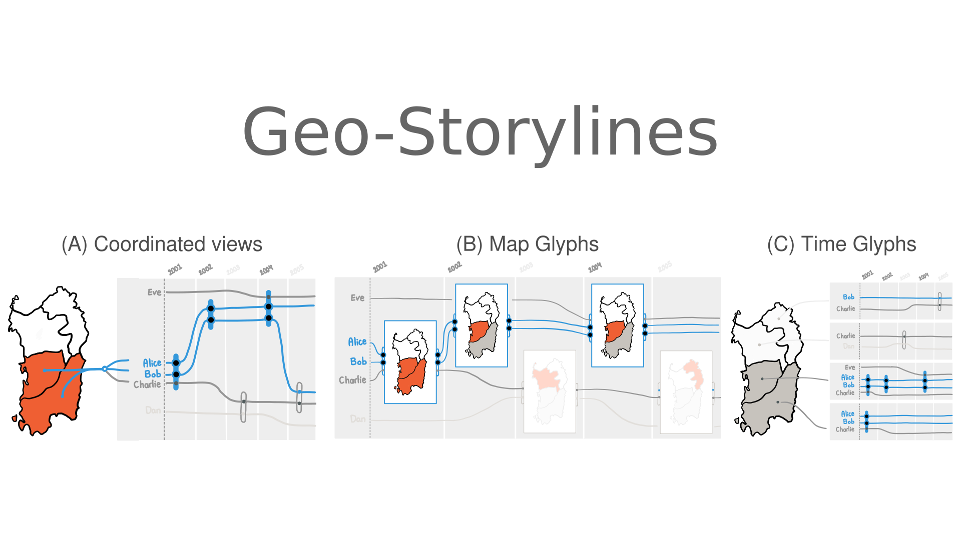
Storyline visualizations are a powerful way to compactly visualize how the relationships between people evolve over time. Real-world relationships often also involve space, for example the cities that two political rivals visited together or alone over the years. By default, Storyline visualizations only show implicitly geospatial co-occurrence between people (drawn as lines), by bringing their lines together. Even the few designs that do explicitly show geographic locations only do so in abstract ways (e.g. annotations) and do not communicate geospatial information, such as the direction or extent of their political campains. We introduce Geo-Storylines, a collection of visualisation designs that integrate geospatial context into Storyline visualizations, using different strategies for compositing time and space. Our contribution is twofold. First, we present the results of a sketching workshop with 11 participants, that we used to derive a design space for integrating maps into Storylines. Second, by analyzing the strengths and weaknesses of the potential designs of the design space in terms of legibility and ability to scale to multiple relationships, we extract the three most promising: Time Glyphs, Coordinated Views, and Map Glyphs. We compare these three techniques first in a controlled study with 18 participants, under five different geospatial tasks and two maps of different complexity. We additionally collected informal feedback about their usefulness from domain experts in data journalism. Our results indicate that, as expected, detailed performance depends on the task. Nevertheless, Coordinated Views remain a highly effective and preferred technique across the board.