A Comparison of Spatiotemporal Visualizations for 3D Urban Analytics
Roberta Mota, Fabio Miranda, Julio Daniel Silva, Marius Horga, Marcos Lage, Luis Ceferino, Usman Raza Alim, Ehud Sharlin, Nivan Ferreira
View presentation:2022-10-21T14:36:00ZGMT-0600Change your timezone on the schedule page
2022-10-21T14:36:00Z
Prerecorded Talk
The live footage of the talk, including the Q&A, can be viewed on the session page, Spatial Data.
Fast forward
Abstract
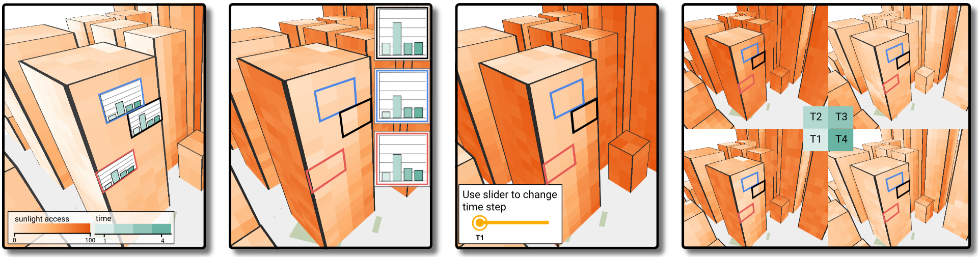
Recent technological innovations have led to an increase in the availability of 3D urban data, such as shadow, noise, solar potential, and earthquake simulations. These spatiotemporal datasets create opportunities for new visualizations to engage experts from different domains to study the dynamic behavior of urban spaces in this under explored dimension. However, designing 3D spatiotemporal urban visualizations is challenging, as it requires visual strategies to support analysis of time-varying data referent to the city geometry. Although different visual strategies have been used in 3D urban visual analytics, the question of how effective these visual designs are at supporting spatiotemporal analysis on building surfaces remains open. To investigate this, in this paper we first contribute a series of analytical tasks elicited after interviews with practitioners from three urban domains. We also contribute a quantitative user study comparing the effectiveness of four representative visual designs used to visualize 3D spatiotemporal urban data: spatial juxtaposition, temporal juxtaposition, linked view, and embedded view. Participants performed a series of tasks that required them to identify extreme values on building surfaces over time. Tasks varied in granularity for both space and time dimensions. Our results demonstrate that participants were more accurate using plot-based visualizations (linked view, embedded view) but faster using color-coded visualizations (spatial juxtaposition, temporal juxtaposition). Our results also show that, with increasing task complexity, plot-based visualizations perform better in preserving efficiency (time, accuracy) compared to color-coded visualizations. Based on our findings, we present a set of takeaways with design recommendations for 3D spatiotemporal urban visualizations for researchers and practitioners. Lastly, we report on a series of interviews with four practitioners, and their feedback and suggestions for further work on the visualizations to support 3D spatiotemporal urban data analysis.