Data Provenance Visualization in Brazilian Public Health Dashboards

Johne Marcus Jarske, Lucia Filgueiras, Leandro Manuel Velloso, Tânia Letícia Letícia dos Santos, Jorge Rady de Almeida Júnior

View presentation:2022-10-16T16:45:00ZGMT-0600Change your timezone on the schedule page
2022-10-16T16:45:00Z
Exemplar figure, described by caption below
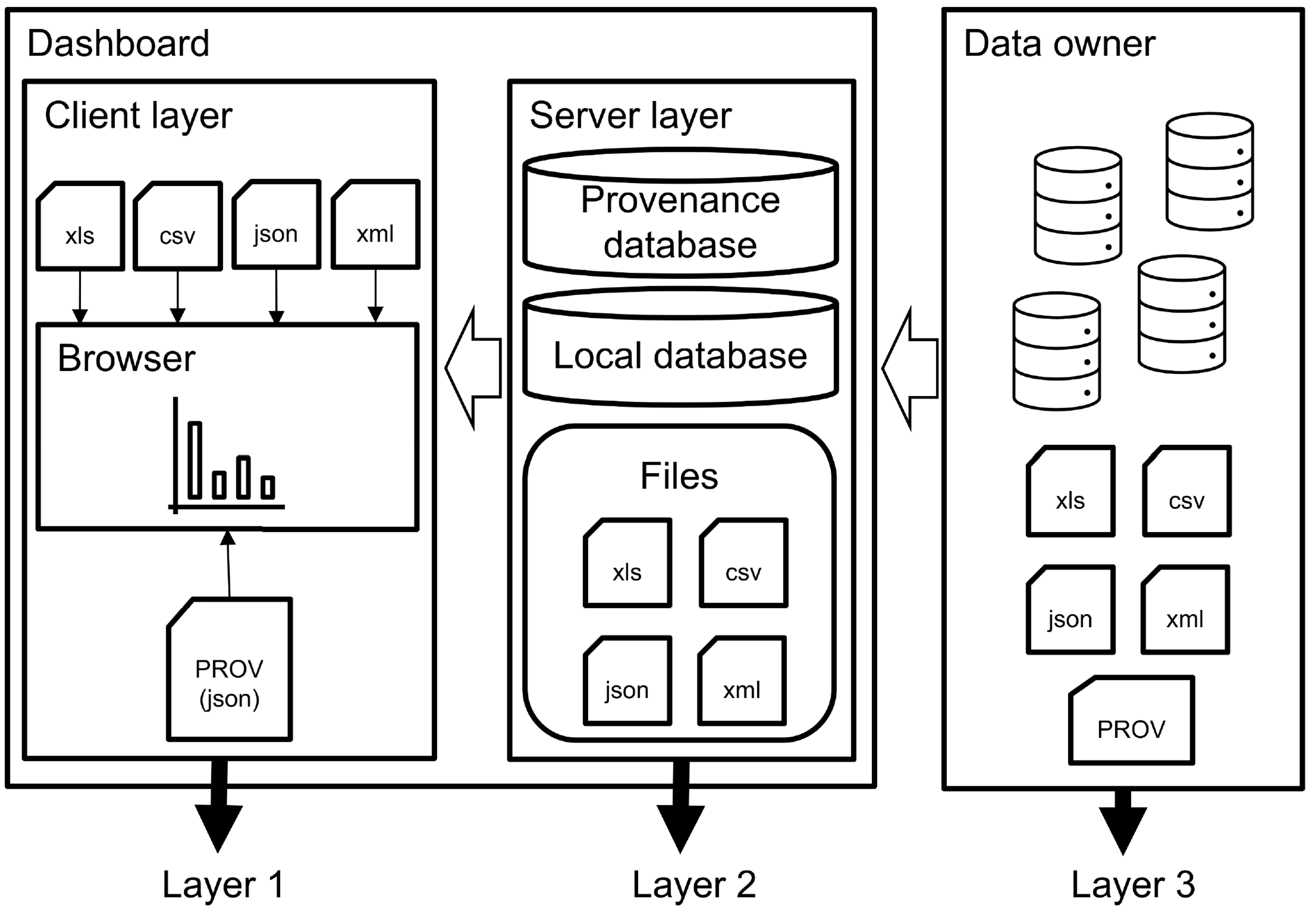
To be useful, provenance data needs to be visualized by the user, preferably in a user-friendly way. Provenance visualization is still an issue, especially for the lay public. Many visualization approaches require a high level of visual literacy such as the diagrams proposed by W3C-PROV. Dashboard users need an easy to interpret visualizations and a more focused set of provenance metadata that enables users to receive precisely what they need to be more confident about the origin of the data. We propose a three-layer provenance approach to show the most valuable provenance metadata to the user: those artifacts delivered to the client browser (datasets and visualizations); data artifacts produced on the server side (the last frontier of data joins and transformations aiming to deliver useful information to the user), and, finally, the data owner, who is responsible for the maintenance of the data). Showing this thee-layer provenance we expect to provide the most important provenance metadata to the user and enable a user-friendly provenance visualization based on iconography and automatically generated infographics.

The live footage of the talk, including the Q&A, can be viewed on the session page, TREX: Session 2.

Abstract