Understanding Systematic Miscalibration in Machine Learning Classifiers

Markelle Kelly, Padhraic Smyth

View presentation:2022-10-16T14:17:00ZGMT-0600Change your timezone on the schedule page
2022-10-16T14:17:00Z
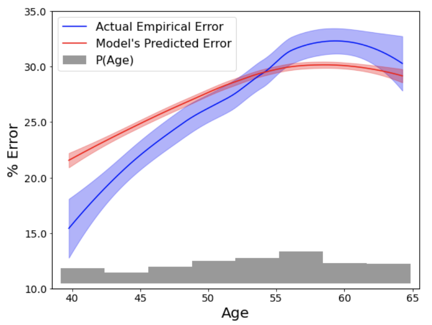
Exemplar figure, described by caption below
A 2D plot with the variable "Age" on the x-axis and "% Error" on the y-axis. The plot includes two curves, with error bars, labeled as the "Actual Empirical Error" (in blue) and the "Model's Predicted Error" (in red). The red curve is significantly (by over five percentage points) higher than the blue curve around age 40, but much lower than the blue curve around age 60.

The live footage of the talk, including the Q&A, can be viewed on the session page, TREX: Session 1.

Abstract